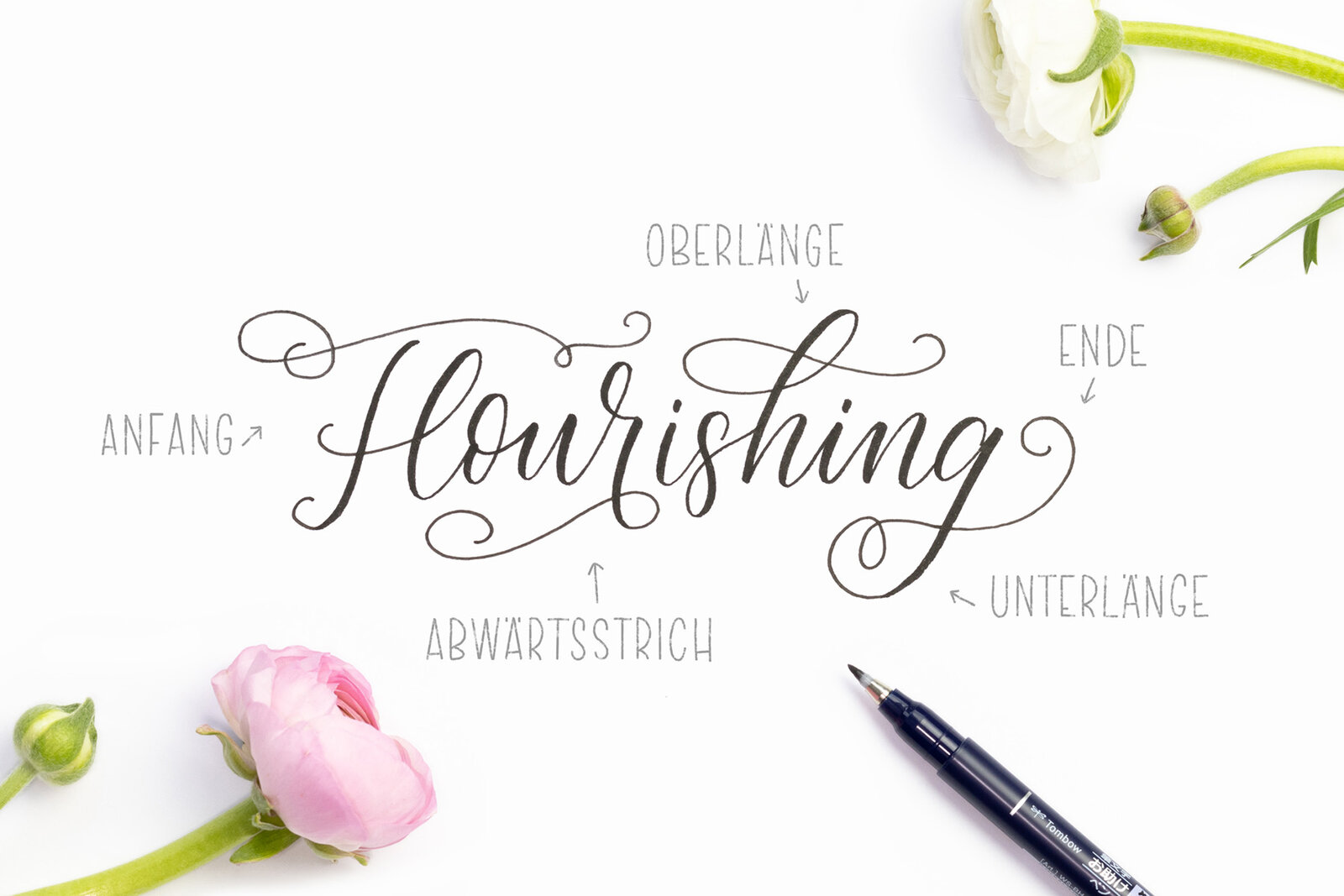
Lettering with flourishes
Flourishes are strokes and decorative lines in and around letters. They allow your lettering to blossom and lend it a beautiful, playful look. It takes a little practice to develop a feel for the right approach and to find the perfect stroke. After a handful of attempts, it is therefore all the more fun to make eye-catching lettering with fine flourishes and attractive decorative lines.
Martina Johanna Janssen of lettering_by_mj explains what you need to watch out for and then provides an application example for you.

The theory
To begin with, flourishing may seem a little complicated – but don’t panic! There are one or two simple tricks to be aware of. For example, there are a few places on letters where strokes and flourishes work particularly well.
Start: the large initial letters in particular work especially well when supplemented with fine strokes.But you can also decorate small letters with light flourishing.
End: if the letter begins with a flourish, it should also end with a flourish. This ensures that everything remains balanced.>
Ascenders and descenders: the loops in the ascenders and descenders in particular are wonderfully suited to incorporating strokes.There are various possibilities for extending the loops left or right.
Downward stroke: the downward stroke can be wonderfully employed to extend a flowing stroke downwards.
Freestanding: you can of course also incorporate flourishes that are not directly connected to the letters.You can be as creative as you like.
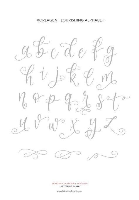
Flourishing template for download
To prepare, you will find a template here that you can print out. You can trace the gray letters to practice with. The Fudenosuke with the hard tip is best suited to this because the small tip allows you to create a delicate, refined look.
Use the template for practice and inspiration. You don’t have to memorize the letters and flourishes because each lettering will be individually decorated with the appropriate flourish later.

Spring Vibes card, here’s how to apply what you have learned!
Material
To replicate the following example, you will need:
- Pencils – MONO 100 HB for sketching/ / 2B for coloring the tracing paper
- Eraser – MONO dust CATCH*
- Brush Pen – such as the Fudenosuke with hart tip
- Paper for Sketching – simple sketching paper
- Paper for transferring – racing paper or sandwich paper
- Paper for the lettering – z.B. Bristol drawing pad
- A little side note: With the MONO dust CATCH eraser from Tombow, you save yourself the irritating task of wiping away eraser dust from the paper. As if by magic, the eraser waste remains attached to the eraser and the used piece can simply be removed.
You still need some of it?
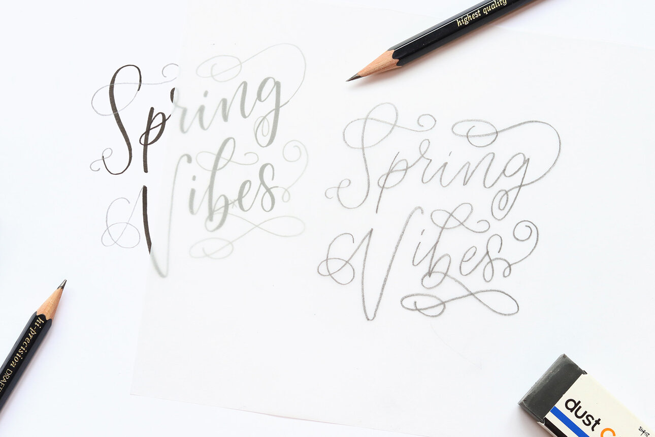
Step 1:
First write the lettering on the sketch paper with the Brush Pen. Reduce the lettering to the essentials and do not add flourishes yet. When it comes to flourishing, the Fudenosuke is my absolute favorite! The fine tip results in a beautiful, delicate look and the fine flourishing can be worked across the paper wonderfully later on.

Step 2:
Look at the lettering and consider where flourishes would be well placed. Gradually add the flourishes to the letters with a pencil (HB). At this point, it is important that the strokes are evenly distributed around the lettering to create balance. Draw the flourishes and strokes on the letters with flair. Have a go and erase again until everything sits well and is nicely distributed.
A little tip: To begin with, it is a little easier to add less flourishing. Concentrate more on one or two good flourishes to avoid being unable to recognize the lettering later on because of heavy flourishing.

Step 3:
When the sketch is finished, it is time to transfer it. This works with tracing paper, for example. If you don’t have any tracing paper, simply use sandwich paper. Place the tracing paper onto the lettering and copy the lettering onto the tracing paper.
Step 4:
Turn the tracing paper over and color the area on the back behind the image with a soft pencil (2B or softer). The result is a kind of carbon paper that can be used to transfer the image easily in the next step.

Step 5:
Now take the paper you wish to transfer the sketch to. Place the tracing paper with the side you have just colored facing down on the chosen paper. Once you have placed it in the desired position, retrace the lines of the letters with the HB pencil. When you have finished, remove the tracing paper and you will see that the template has been transferred onto the paper.

Step 6:
You can now simply retrace the template with the Brush Pen or another pen of your choice. Here. I prefer to only draw fine strokes on the letters – this highlights their delicate, playful character.

Favorite tip:
Don’t throw away the tracing paper with the template on! You can reuse the template on the tracing paper and therefore reproduce the image multiple times. To do this, recolor the back a little and repeat steps 5 and 6.
Personally, I have an entire folder full of my favorite templates on tracing paper. Whenever I need a card for a nice greeting at short notice, I look for an appropriate image from my collection and transfer it to some nice paper.

Done!
Please let us know how helpful this article was for you to copy. You are welcome to write us a message if you have any suggestions for improvement or other feedback for us. We read everything, we promise PS: We are of course also curious about your results. Feel free to show us your work on Instagram or Facebook and share it with the community.