
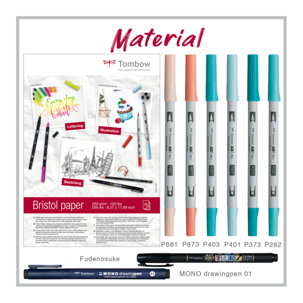
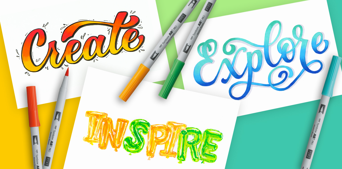
Rediscover handlettering with the alcohol-based ABT PRO markers.
Learn all about the world of graphic lettering! Moira aka @hellohoney_nbg shows you, with a step-by-step tutorial, how easy it is to letter with the ABT PRO markers.

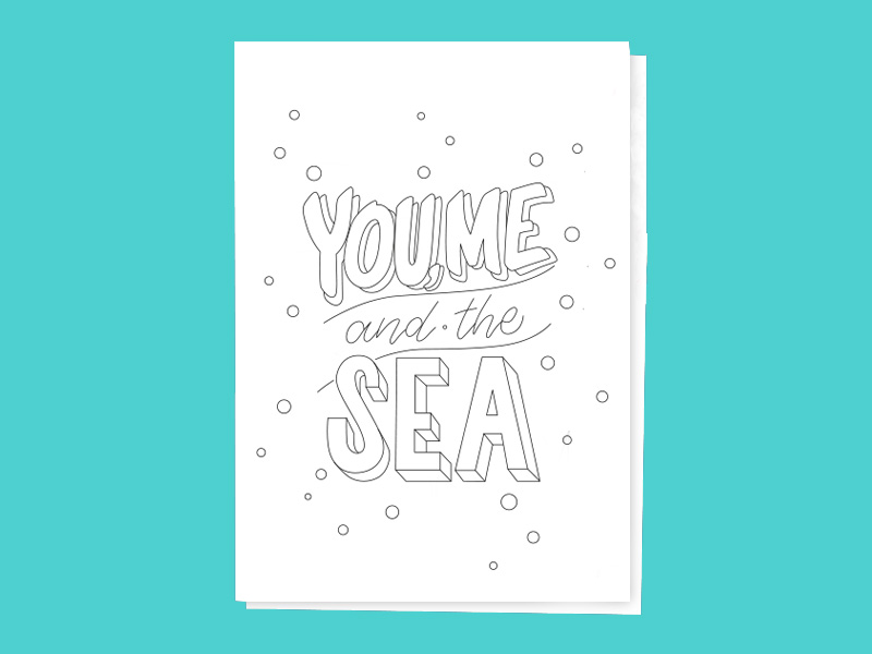
Preparation: Transfer template
Before we begin, Moira will show you how to transfer sketches to Bristol paper. The best pencil to use for this is a soft grade B pencil. Don't know how to transfer sketches correctly? No problem, we have summarized it for you in this article:
Step 1: Color "You, Me
After you've transferred the sketch to the Bristol paper, you're ready to start coloring.
Tip from Moira: Open the pens, arrange them in the correct order, and place them loosely in the caps. This way you'll have all the colors at hand, which will make switching between colors go more smoothly.
Work your way through one letter at a time, starting at the top of the "Y" with shade 881. Be careful to fill in the first layer of color all the way to the edge. It is best to use lightly feathered strokes for this.
![[Translate to Englisch:] Bild von einem halb kolorierten Buchstaben.](/fileadmin/user_upload/ABTP_WS_01.jpg)
![[Translate to Englisch:] Bild von einem kolorierten Buchstaben.](/fileadmin/user_upload/ABTP_WS_02.jpg)
There are two important tips when blending alcohol-based colors:
1. You should blend the colors together when they are still wet, as this is when the effect is best.
2. Patience: the effect of blending alcohol-based markers takes a moment to be apparent, and in most cases just a few strokes are enough.
If you want to increase the contrast in one of the colors, you can add another layer of paint to your image.
Step 2: Blended Brush Lettering
To achieve a nice blended brush lettering style, it's best to draw the line in one go. To do this, rotate the image at a slight angle. Once the strokes are complete, add "and the" between the two lines.
Want to learn more about Brush Lettering? Then visit our Handlettering page and get free practice sheets to get started with Brush Lettering
You only need color 373 in this step, and you can also create a blending effect with just one color by applying another layer to the bottom of the letter with the same shade. This will increase the saturation of the hue and make the color appear slightly darker. Learn more about the monochrome effect here.


Step 3: Color "Sea
Next, color the individual letters of the word "Sea". You will need the colors 282, 373 and 403. Mentally divide the letter into three sections and start coloring the upper part with the color 282. When this part is finished, switch to 373 and blend the two colors. Finally, take color 403 and 373 and blend in both directions. Repeat this procedure for each letter.
![[Translate to Englisch:] Bild von einem kolorierten Buchstaben mit Farbübergängen.](/fileadmin/user_upload/ABTP_WS_03.jpg)
![[Translate to Englisch:] Bild von einem kolorierten Wort mit Farbübergängen.](/fileadmin/user_upload/ABTP_WS_04.jpg)
Step 4: Contours/Outlines
To set the perfect outlines, Moira again reveals a few of her tips. She uses the Fudenosuke Brush Pen and for very fine corrections the MONO drawing pen Fineliner. If the color hasn't dried yet, put a piece of paper on top of your painting to protect it from smudging.
For the outlines, you should avoid stopping and restarting if possible. Try to work your way from edge to edge with just one stroke. Rotate the paper so you can work better and take your time with the outlines. For small corrections of the outlines, it is advisable to touch up later with the MONO drawing pen. Remember: less is more.
![[Translate to Englisch:] Bild, bei dem Konturen eingezeichnet werden.](/fileadmin/user_upload/ABTP_WS_05.jpg)
![[Translate to Englisch:] Bild mit fertigen Konturen.](/fileadmin/user_upload/ABTP_WS_06.jpg)


Try it out for yourself right now and share your lettering artwork with the Tombow family at #abtprolettering.
![[Translate to Englisch:] Bild von Moira](/fileadmin/user_upload/moira_930x500px.png)
Moira Schweiger
- Hello Honey
My name is Moira, I am 37 years old and my passion is letters - ever since my communication design studies. After graduating in 2007, I worked as an art director in various advertising agencies. In 2010 I founded moira styles and since then I've been working with my own clients as well as agencies on various communication and design projects.
Since then I have also been involved in handlettering or "drawing fonts", which was completely unknown in Germany at the time. Since spring 2017, I have been organizing workshops all over Germany on the topics of hand- and brushlettering.
You can find an insight into my love of letters on Instagram