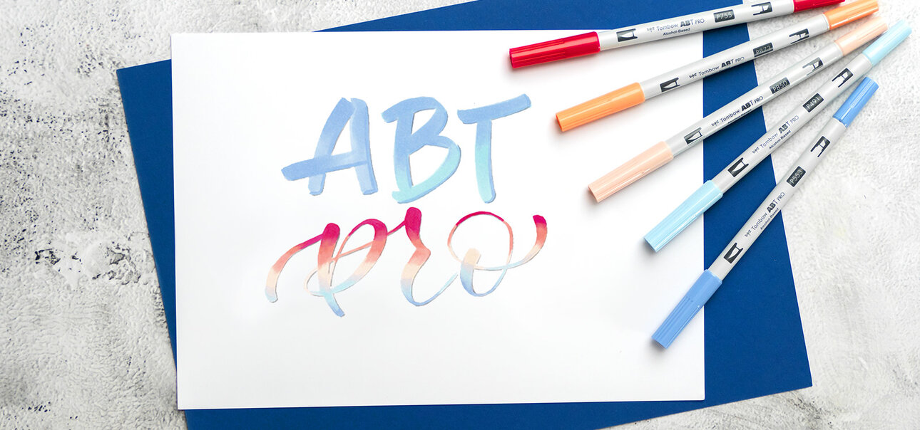
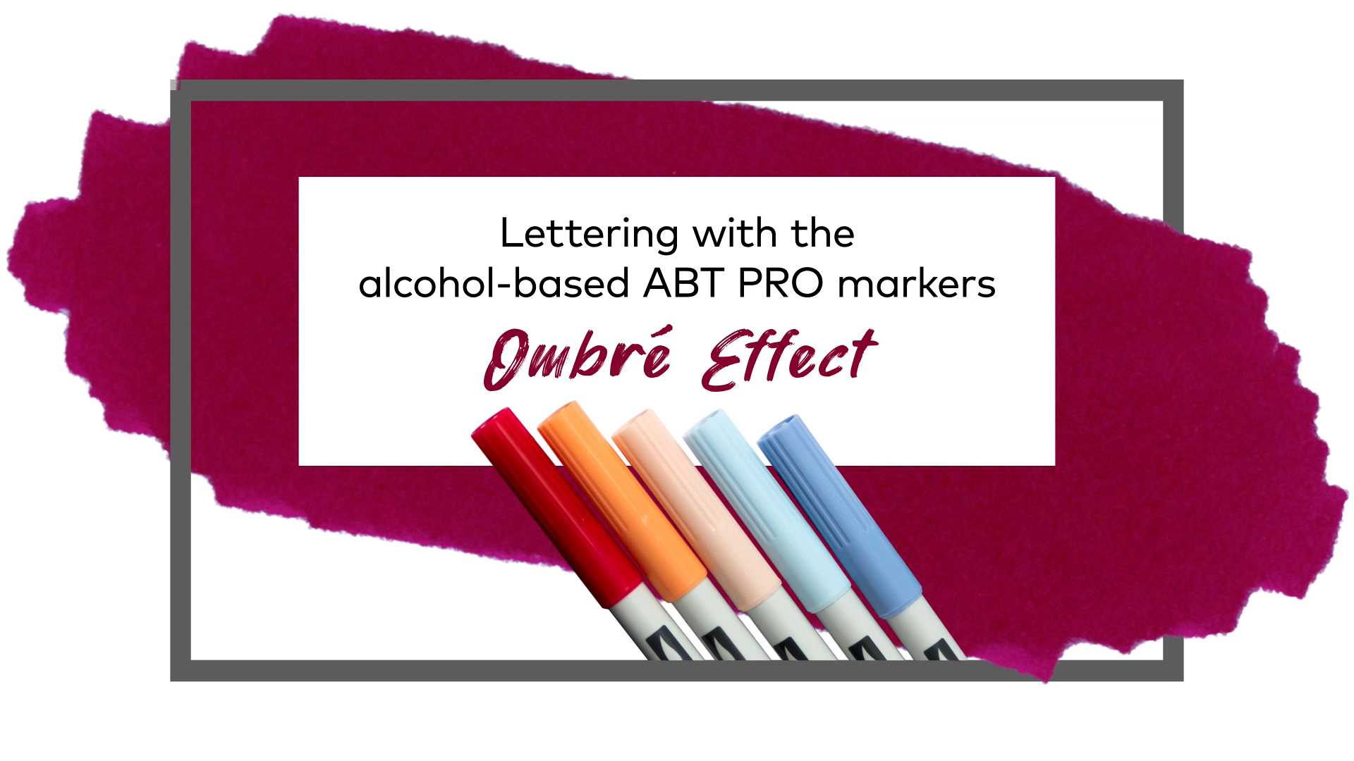
Find your lettering style with the alcohol-based ABT PRO markers!
Expand your lettering skills with the new possibilities of alcohol-based ink. In contrast to many other brush pens, you can create color transitions with this ink without using any water or an additional blender pen. Alcohol-based ink also has the advantage that the original color is not lightened as it is with water-soluble inks.
The various lettering techniques
Thanks to the flexible brush tip and the chisel tip, you can achieve countless fonts and techniques with various effects using the ABT PRO markers. Use the flexible brush tip for brush lettering fonts, the chisel tip for Fraktur fonts, or achieve thick street art styles that you can color streak-free.
Because there are countless fonts and effects, we have selected three techniques with effects as inspiration that we would like to explain to you in more detail.
Blended Brush Lettering
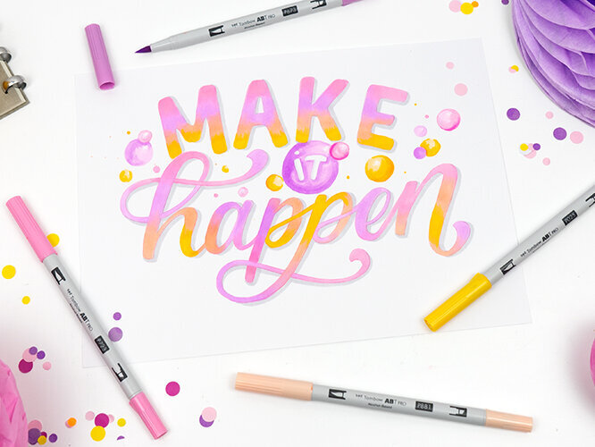
Blended brush lettering has long been a term used by lettering fans. Here, delicate letters are created with the brush tip that – by applying additional colors – become a complete, brightly colored artwork with smooth color transitions. Those who are skilled in the basic principles of brush lettering have an advantage here.
If you are new to lettering, you will find helpful tips and tricks on our handlettering page, as well as practice sheets for getting started.
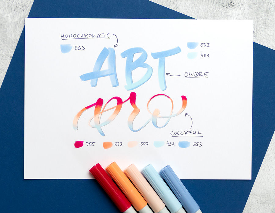
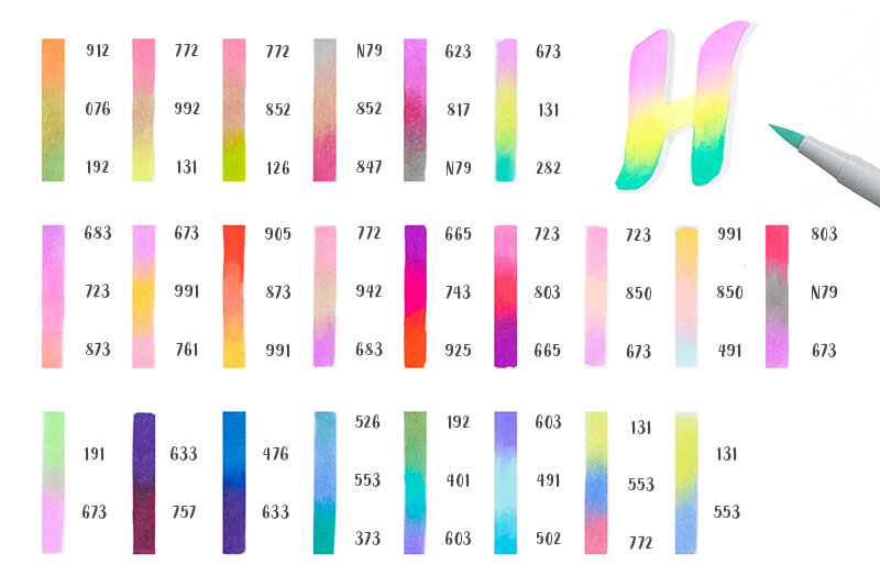
Depending on the number and choice of colors, you can create various effects: with a single color, you can create a monochrome effect using layers of color. If you select colors from one color family, you can create a color gradient with ombré effect. The color mixing effect is the result of combining harmonious colors.
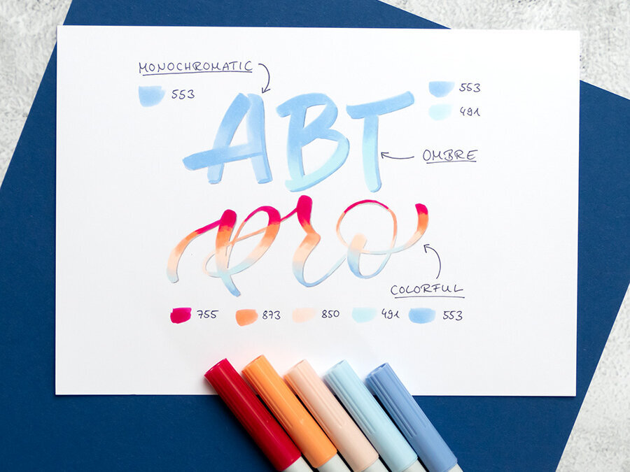
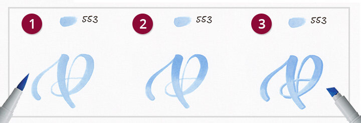
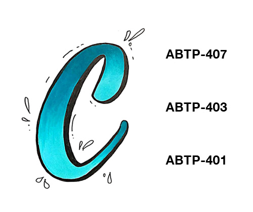
Monochromatic Effect
Selected colors are suitable for the monochromatic blending effect. By applying the ink several times (so-called layering), you increase the saturation of your basic color, thereby making it darker. If you only apply these layers to specific areas of your letter, you produce color gradations within the same color tone. This means you achieve a three-dimensional effect with just one pen.
Monochrome effect in use:
Step 1: Sketch out your letter.
Step 2: Apply additional layers of color to a section of the letter using small brush strokes and draw the color out to the end.
Step 3: Using the chisel tip, trace along one side of the entire letter to create a shadow effect.

Linking to the video streaming service is disabled to protect your privacy. Click here to activate it. By loading the video, you accept the privacy policy of the video streaming service. Further information about the privacy policy can be found here: Google - Privacy & Terms

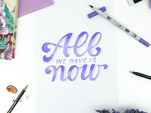
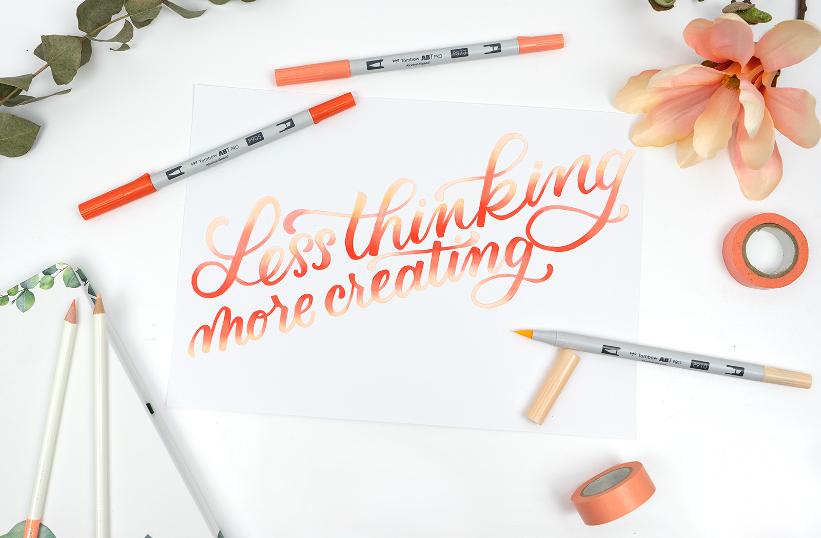
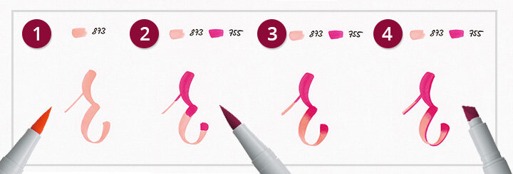
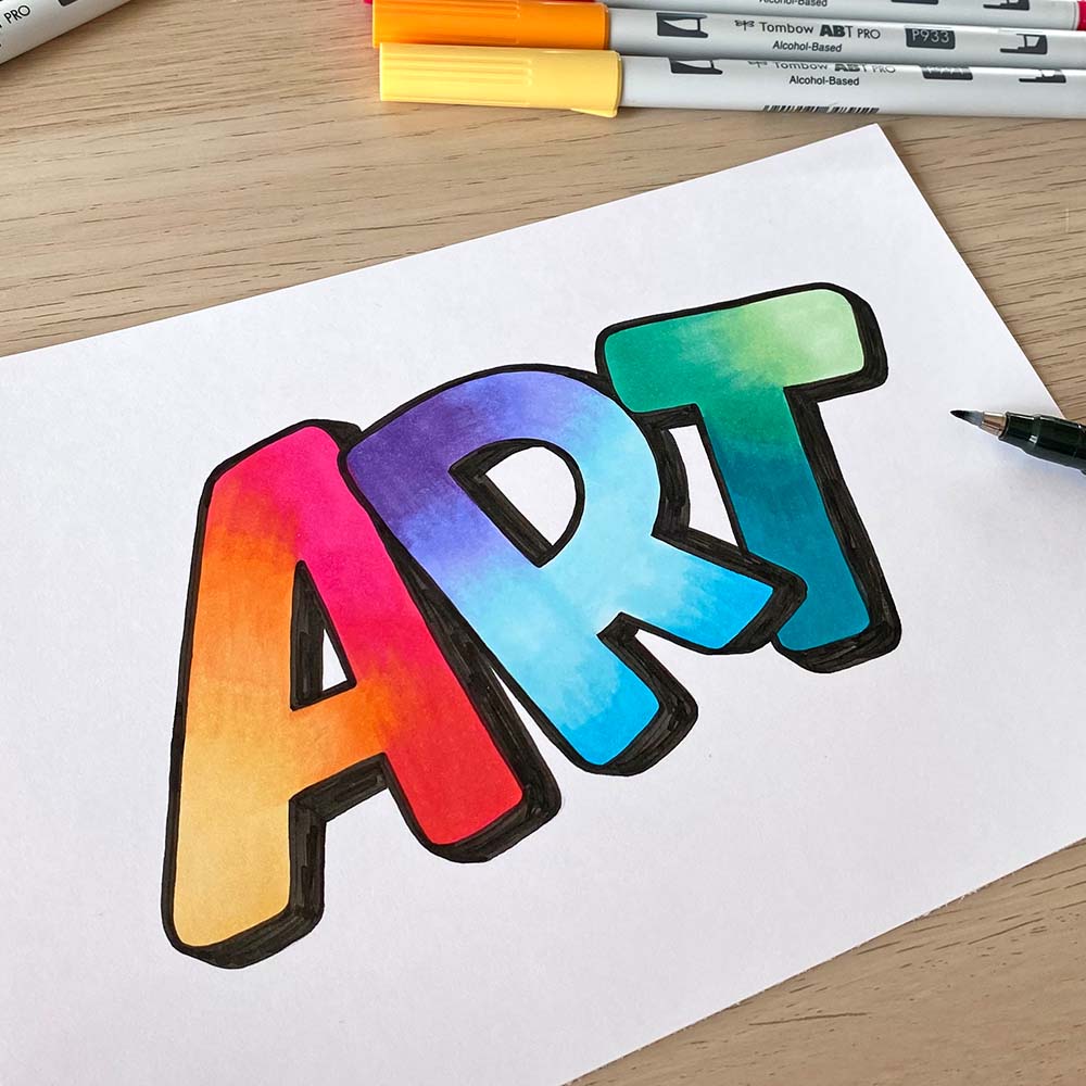
OMBRÉ EFFECT
The term ombré effect generally refers to a soft color gradient between two colors. Because ombré can be translated as “shaded,” we usually assume a darker color that merges into a lighter color. Choose colors from the same color family – but particularly intriguing effects can also be created using adjacent color families, for example the transition from a bold blue to a soft turquoise or from a vibrant orange to a soft yellow. You can thereby achieve a harmonious gradient within the color palette without lightening the original color.
Ombré effect in use:
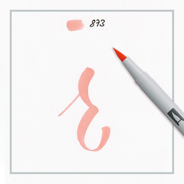
Step 1: Draw out the letter with the lightest color tone.
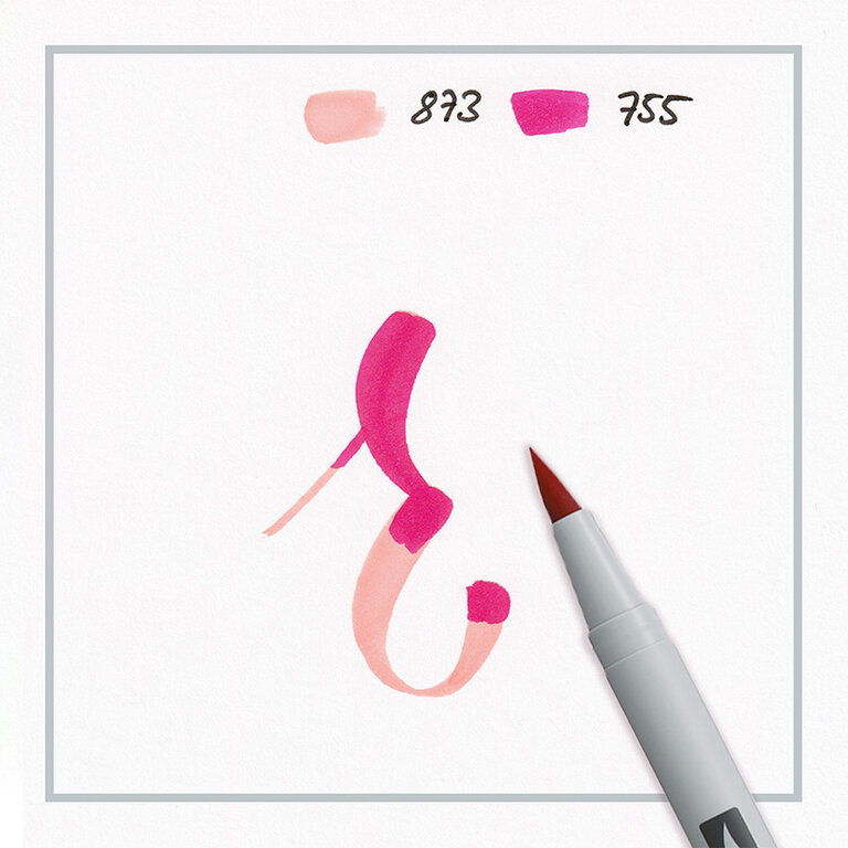
Step 2: Then apply the darker color tone onto a section of the letter. Whether you choose the upper or lower section of the letter is up to you.
Step 3: Now alternate between the lighter and darker tone using light brush strokes to create a soft transition between the two colors.
Step 4: With the edge of the chisel tip, color-coordinated outlines can also be added for a three-dimensional effect.
Linking to the video streaming service is disabled to protect your privacy. Click here to activate it. By loading the video, you accept the privacy policy of the video streaming service. Further information about the privacy policy can be found here: Google - Privacy & Terms
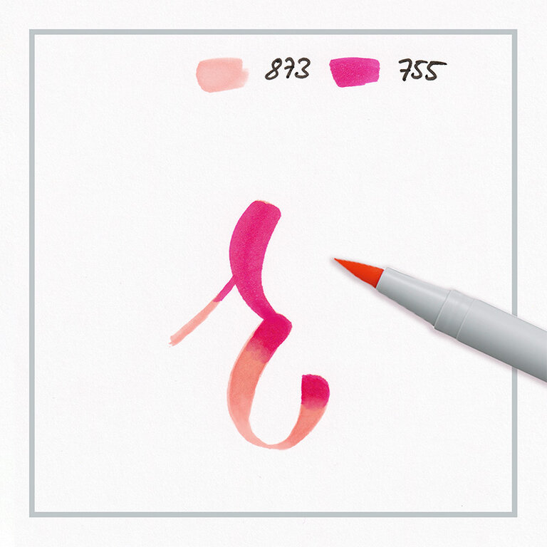


COLORFUL-BLENDING-EFFEKT
With the term “colorful blending effect,” we are describing the multicolored color gradient within a letter. Here, it is possible to combine very different colors with one another in one letter. Unlike with the “ombré effect,” choosing the right color tones means that transitions with several colors from different color palettes can be achieved.
Colorful blending effect in use:
Step 1: Draw out the letter with the lightest color tone.
Step 2: Then apply the darker color tone onto a section of the letter. Whether you choose the upper or lower section of the letter is up to you.
Step 3: Now alternate between the lighter and darker tone using light brush strokes to create a soft transition between the two colors.
(Optional) Step 4: With the edge of the chisel tip, color-coordinated outlines can also be added for a three-dimensional effect.

Linking to the video streaming service is disabled to protect your privacy. Click here to activate it. By loading the video, you accept the privacy policy of the video streaming service. Further information about the privacy policy can be found here: Google - Privacy & Terms
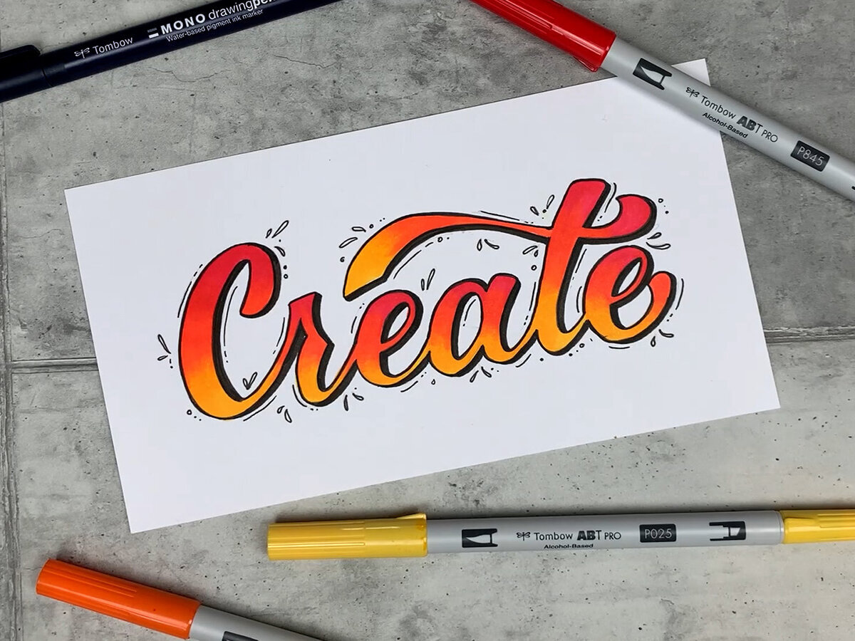
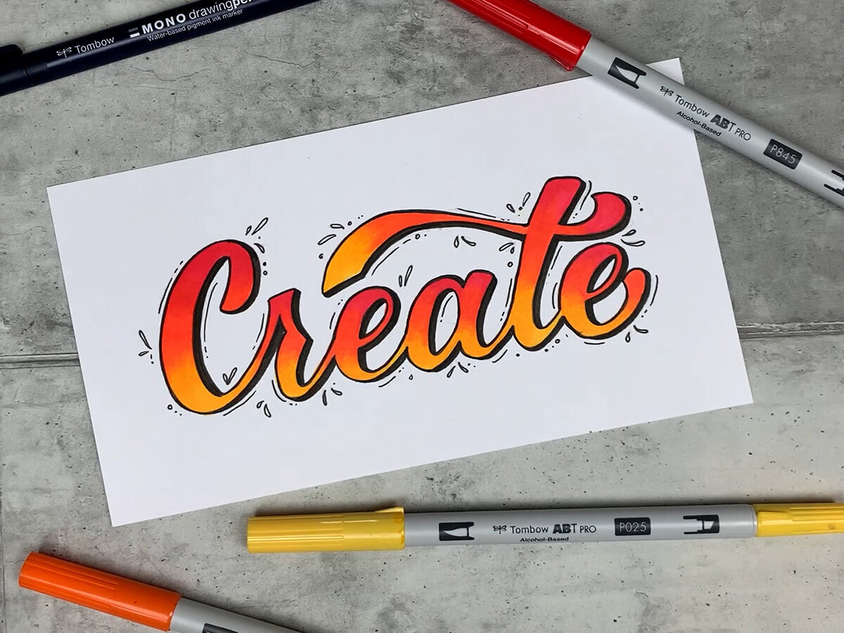
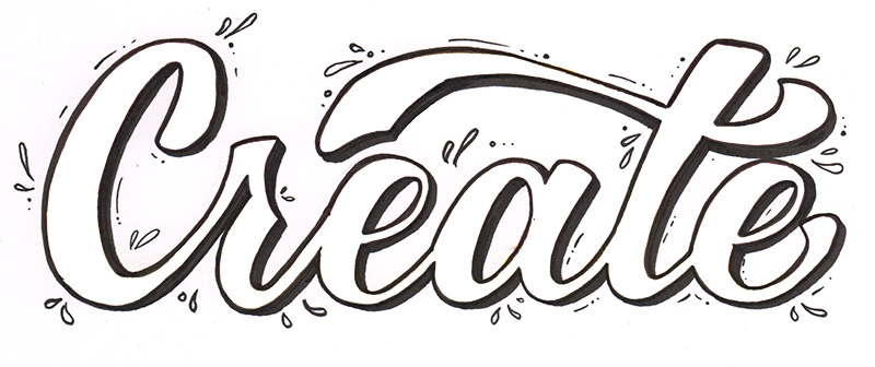
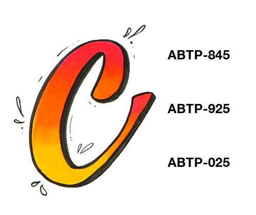
Graphic Lettering
Unlike the blended brush lettering where you apply the letters straight onto the paper and create color gradations using various layers, the composition of the letter is fixed in advance with graphic lettering. Here, letters are delicately sketched out in advance in pencil and are then colored in. This usually results in larger artworks and fonts with thicker letters. Because you are coloring in the sketched-out letters, prior knowledge about brush lettering and upward and downward strokes is not necessary. Outlines provide attractive contours and extra plasticity.
Linking to the video streaming service is disabled to protect your privacy. Click here to activate it. By loading the video, you accept the privacy policy of the video streaming service. Further information about the privacy policy can be found here: Google - Privacy & Terms
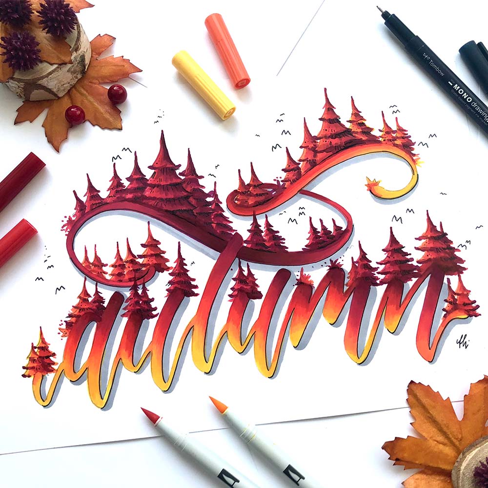
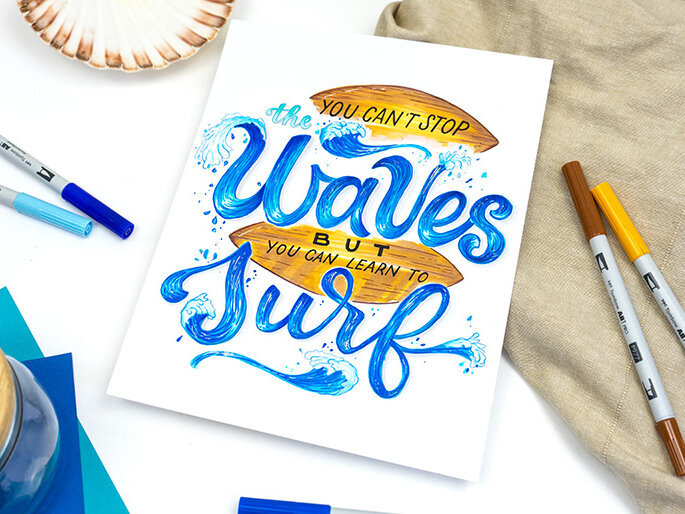
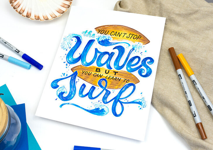
Illustrative Lettering
Illustrative lettering is generally composed of one lettering font alongside additional illustrative elements. But balloon lettering or especially illustrative effects also work well with the ABT PROs – there is no limit to your creativity. You thereby embed your lettering within a complete artwork.
The most important tips and tricks for using alcohol markers for lettering
Outlines can help your lettering appear more vibrant and lend the artwork more depth. For black outlines, waterproof pens such as the MONO twin are suitable. If you wish to apply the outline before coloring, you should use water-resistant pens like the MONO drawing pen or Fudenosuke, whose ink does not react with the alcohol. For bright color effects, the TwinTone, ABT Dual Brush Pens, or colored pencils such as the Irojiten are also suitable.
When sketching for alcohol-based artworks, you should ensure that the pencil has a high degree of hardness, such as 2H, and therefore contains less graphite. The alcohol in the ink may cause the graphite to smear. To really play it safe, you can use an eraser to erase your sketch to the point that it is all but invisible.


